Your Ultimate Dashboard Jenkins Guide

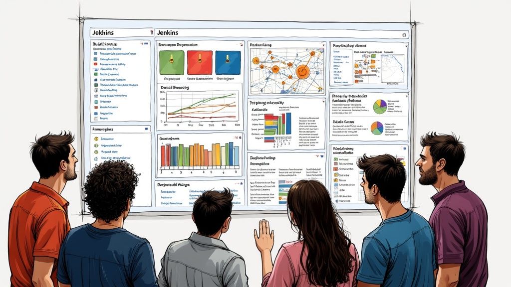
A custom dashboard in Jenkins is more than just a fresh coat of paint; it's a strategic shift that turns your CI/CD pipeline from a simple list of jobs into a genuine command center. This is about moving your team from a state of reactively fixing problems to proactively spotting trends and fine-tuning your entire workflow. You gain immediate, actionable insights with just a glance.
Why a Custom Jenkins Dashboard Is a Game Changer
Let's be honest, the default Jenkins interface gets the job done, but it’s hardly inspiring. It gives you a raw, unfiltered list of build jobs that can get overwhelming fast, especially when you're juggling dozens of microservices in a complex project. A custom dashboard cuts right through that noise.
This isn't just about making things look pretty. It's about creating a purpose-built view tailored to specific roles on your team. A developer, for example, might need to see test result trends for their specific feature branch. A manager, on the other hand, needs a high-level overview of deployment frequency and success rates across the entire organization.
From Reactive to Proactive Monitoring
Without a centralized dashboard, teams often find out about issues only after a build has failed and brought progress to a grinding halt. A well-configured dashboard completely flips that dynamic.
- Spot Failure Trends: By visualizing your build history, you can easily spot a job that's becoming increasingly unstable over time. This lets you investigate before it causes a major outage.
- Identify Bottlenecks: A clear view of your pipeline stages can instantly reveal which part of your process—be it testing, building, or deploying—is creating a slowdown.
- Improve Accountability: When key metrics like code coverage and build stability are visible to everyone, it fosters a shared sense of ownership over quality.
The complexity of getting these systems right helps explain why so many companies invest in getting their setups right. In fact, North America's market for Managed Jenkins Services is estimated at approximately USD 420 million in 2024. That’s a lot of organizations deciding that expert help is worth it.
By tailoring your dashboard, you give different stakeholders the exact information they need, eliminating distractions and enabling faster, more informed decisions. It’s the difference between navigating with a compass and navigating with a real-time GPS.
This quick comparison highlights the practical leap in visibility and efficiency when you move beyond the standard Jenkins interface.
Default View vs Custom Dashboard at a Glance
| Capability | Default Jenkins View | Custom Jenkins Dashboard |
|---|---|---|
| Information Display | A basic, unfiltered list of all jobs and their last status. | Visual charts, graphs, and widgets tailored to specific metrics. |
| Role-Based Views | One-size-fits-all. Everyone sees the same overwhelming list. | Specific views for developers, QA, and managers showing relevant data. |
| Trend Analysis | Requires manually clicking through individual job histories. | At-a-glance trends for build stability, duration, and test results. |
| Proactive Alerting | Limited to simple pass/fail notifications for individual jobs. | Can highlight degrading performance or increased failure rates over time. |
| Efficiency | Forces users to hunt for information, slowing down response times. | Surfaces critical information immediately, enabling faster decisions. |
Moving to a custom dashboard isn't just an upgrade; it’s a fundamental improvement in how your team interacts with your CI/CD process.
Ultimately, a custom dashboard empowers your team to ship better software, faster. For those looking to dig deeper, you might be interested in our guide to building an effective continuous integration dashboard for more advanced strategies.
Before you even think about installing plugins or dragging widgets around, let's talk about laying the groundwork. A powerful Jenkins dashboard is built on a solid foundation, and a little prep work now will save you a world of headaches later. It's the difference between a dashboard that delivers real, actionable value and one that just becomes another noisy interface everyone ignores.
This groundwork is what makes a view truly reflect what your team needs.
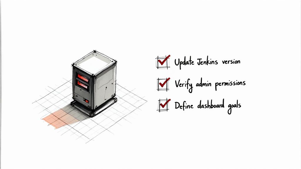
First things first, give your Jenkins instance a quick health check. You'll want to be on a recent, stable version of Jenkins. Trust me, trying to get shiny new dashboard plugins to work on an old, crusty Jenkins core is a recipe for compatibility nightmares and weird, unexpected errors.
While you're at it, make sure you actually have the right permissions. You'll need to be a Jenkins admin, or at least have the rights to install plugins and create new views. Getting this sorted out now prevents that frustrating "Permission Denied" roadblock right when you're in the zone.
What's This Dashboard Actually For?
This is the most critical step, and it's the one most people skip. Without a clear goal, dashboards inevitably become a cluttered mess of graphs that look impressive but tell you nothing. To avoid that, sit down with your team and ask a few pointed questions.
- Who is this for? Is it for developers who need to see the status of their feature branches? Or is it for managers who only care about overall deployment frequency and lead time? The audience dictates everything.
- What problem are we solving? Are you trying to hunt down the root cause of frequent build failures? Maybe you're laser-focused on speeding up deployment times. The dashboard should be a tool to solve a specific problem.
- What’s the one metric that matters most? If you could only show a single piece of information, what would it be? Start there. That's your north star.
Defining a clear "why" is the whole game. A dashboard built to answer specific questions for a specific audience is a tool; a dashboard built to show "everything" is just noise.
Clarifying these goals from the get-go ensures the dashboard in Jenkins you build will have an immediate, tangible focus. This isn't just about Jenkins; it's a fundamental principle of effective CI/CD. For a deeper dive into how Jenkins fits into the bigger picture, check out our guide on the fundamentals of CI/CD with Jenkins.
Answering these questions upfront will guide every single decision you make from here on out, from the plugins you choose to how you arrange the widgets on the screen.
Choosing the Right Plugins for Maximum Visibility
A fresh Jenkins install is functional, but it's just a starting point. The real magic happens when you tap into its massive plugin ecosystem. This is where you transform a basic job runner into a genuine command center for your CI/CD pipelines, giving you immediate, actionable insights.
It's easy to get lost in the options. There's a reason Jenkins is used by over 32,750 verified companies—its power comes from more than 2,245 available plugins that cover just about any scenario you can dream up. The trick is to avoid analysis paralysis. Start with a handful of high-impact plugins that give you the biggest visibility boost right out of the gate. You can get a sense of its widespread use at data.landbase.com.
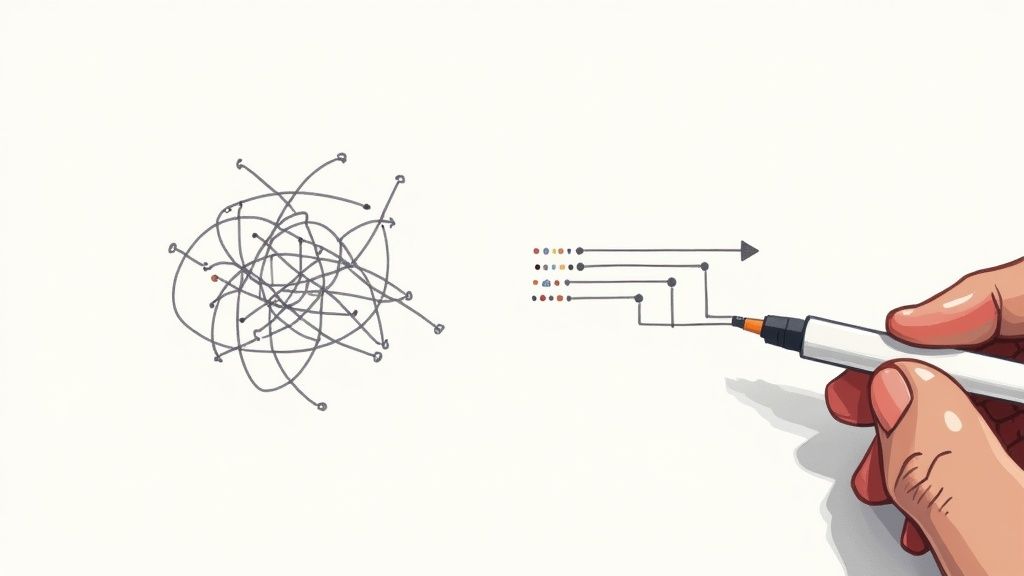
This flow shows the best way to think about building up your dashboard—start with a solid foundation and add layers of insight incrementally.
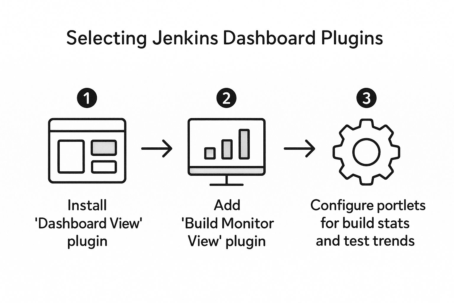
As you can see, it all begins with the core Dashboard View. From there, you branch out into specialized views and metrics. This isn't just a diagram; it's a proven roadmap for creating a dashboard that people will actually use.
To get started, I've put together a quick-glance table of some of the most essential plugins that I always recommend.
Essential Jenkins Dashboard Plugins
| Plugin Name | What It Does | Ideal for Monitoring |
|---|---|---|
| Dashboard View | The foundational plugin that allows you to create a widget-based, customizable dashboard. | Overall project health, job statuses, and key CI/CD metrics in one place. |
| Build Monitor View | Creates a full-screen "radiator" view of job statuses, perfect for a team-facing monitor. | Real-time build health, immediate failure alerts, and team-wide awareness. |
| Pipeline Stage View | Provides a classic, graphical overview of the stages within a Jenkins Pipeline. | Pipeline bottlenecks, stage durations, and identifying the exact point of failure. |
| Blue Ocean | A modern, more user-friendly UI for visualizing and managing complex Jenkins Pipelines. | Detailed pipeline flows, parallel stage execution, and log analysis. |
These plugins work together to turn raw data into a clear story about your development process, moving you from simply running jobs to truly understanding them.
Start with the Dashboard View Plugin
The first plugin you should grab is Dashboard View. It's the cornerstone of any custom dashboard. Think of it as the blank canvas you'll use to paint a picture of your CI/CD health. Without it, you’re stuck with the default, uninspiring list of jobs.
Once you have it installed, you can create a new type of view that serves as a container for different informational widgets, which Jenkins calls "portlets." These are just small, configurable blocks that display specific data points.
Your goal isn't just to display data; it's to tell a story. Does this portlet help us understand build health, test quality, or deployment speed? If not, it's just clutter.
For a new project dashboard, a solid starting point is to include portlets like:
- Jenkins Jobs List: A filtered list showing the status of all jobs relevant to that specific view.
- Test Results Trend: A graph that visualizes the pass/fail rate of your automated tests over time. It makes spotting quality regressions incredibly easy.
- Build Statistics: A high-level summary of build success and failure rates.
Add Visuals with the Build Monitor View
While the Dashboard View is perfect for detailed, widget-based layouts, sometimes you just need a big, obvious status screen for the whole team. That's where the Build Monitor View plugin comes in. It creates a full-screen display that turns any spare monitor into a powerful information radiator.
This view is ideal for the dev floor or a team's common area. It uses large, color-coded cards that are instantly readable from across the room. A wall of green is a clear sign that everything is humming along. But a single red card? It immediately draws everyone’s attention to a problem. This kind of ambient awareness is fantastic for fostering a culture of shared ownership and quick response times.
Enhance Observability with Pipeline Visualization
Modern CI/CD isn't just a single build step; it's a complex, multi-stage pipeline. Trying to debug a failure by scrolling through a massive wall of text in the default Jenkins log is a painful experience. Plugins that visualize these pipelines are non-negotiable for real observability.
I highly recommend looking into tools like the Pipeline Stage View or Blue Ocean, which provide a clean, graphical representation of your pipeline's execution. Suddenly, you can see everything:
- Stage Duration: Instantly spot which stages are slowing you down.
- Parallel Execution: Clearly visualize how parallel tasks are running.
- Failure Points: Pinpoint the exact stage where a build broke, no log-diving required.
This level of insight is what separates a basic CI setup from a mature DevOps practice. If you want to explore this topic further, we've covered a broader range of similar tools in our guide on essential DevOps observability tools. By picking the right mix of plugins, you build a dashboard that doesn't just report status—it actively helps your team get better.
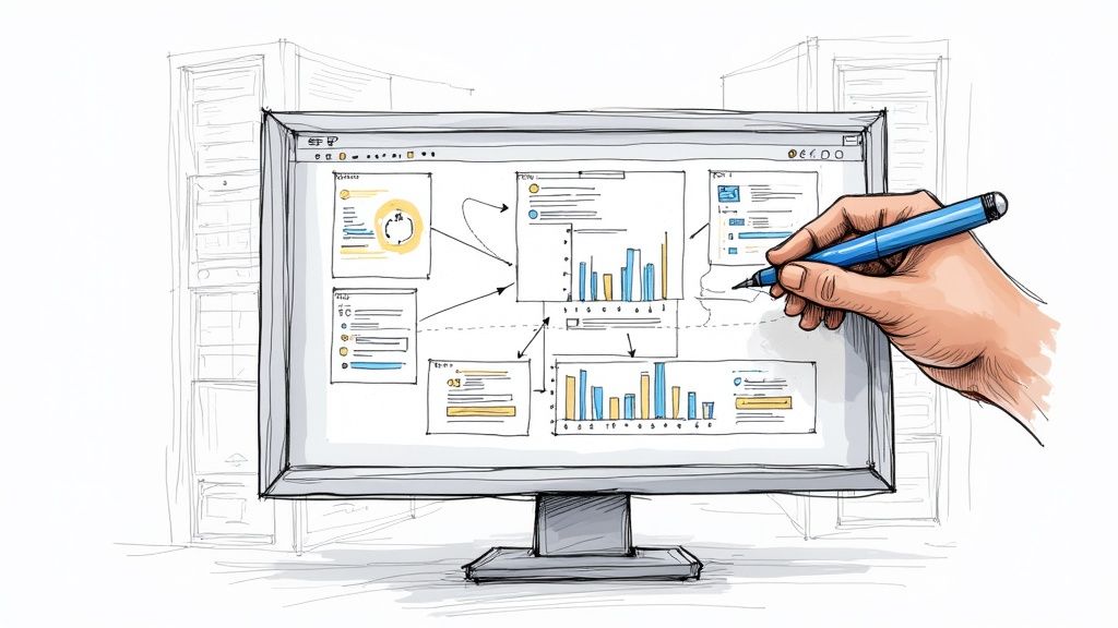
Alright, you've got the plugins sorted. Now for the fun part: turning that blank Jenkins canvas into a dashboard that actually tells you something useful. We're going to build a brand new "Dashboard View" from scratch and fill it with the widgets—or "portlets," as Jenkins calls them—that matter most.
Let's imagine we're creating a dashboard for a single, crucial project: the "Authentication Service." The whole point is to get a one-stop-shop view of this microservice's health, from build status all the way to code quality.
Creating the View Container
First things first, you need a place for your dashboard to live. Head to your main Jenkins page and look for the little (+) tab next to the default "All" view. Click that.
Jenkins will prompt you for a "View name." Don't get lazy here. Generic names like "Dashboard 1" are a recipe for confusion down the road. Go with something descriptive, like "Auth_Service_Dashboard". It’s immediately obvious what it's for. Then, just pick "Dashboard" from the list of view types and hit "OK."
You'll be staring at a pretty underwhelming empty dashboard. Don't worry. This is the foundation we're about to build on.
Adding Essential Portlets
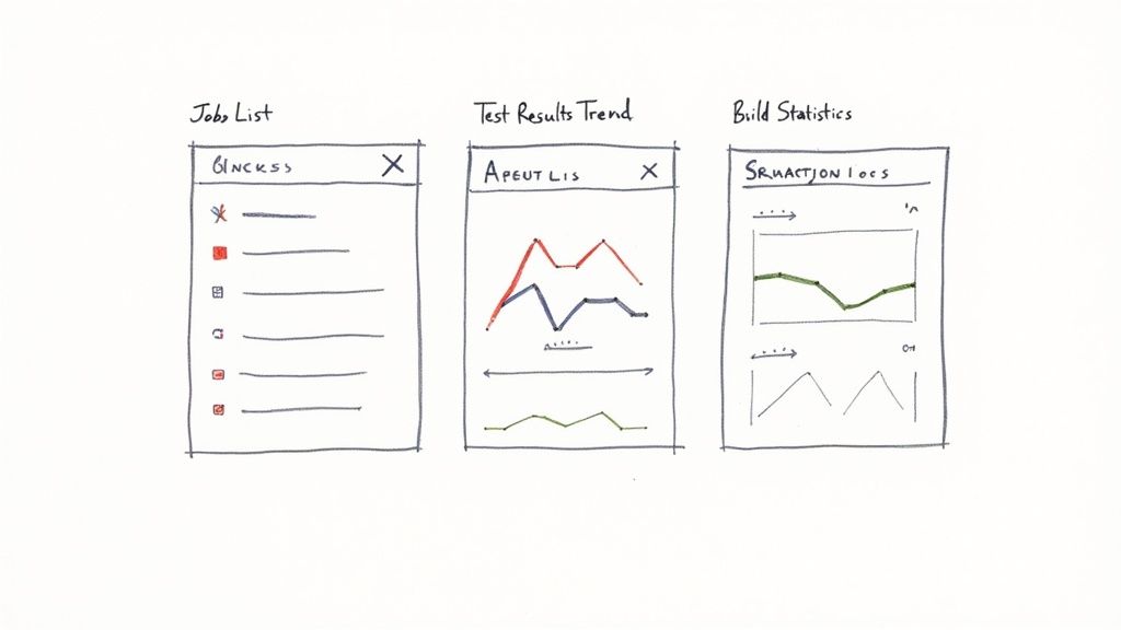
Your new dashboard is basically a set of columns: a top row, then left and right columns below it. You'll add portlets into these slots to display information. We’ll start by adding three core portlets to give us a powerful, at-a-glance summary for our Authentication Service.
A good dashboard answers critical questions instantly. For any developer, those questions are usually: "What's the status of my jobs?" and "Did my last commit torch the tests?"
Let's start by setting up a main central column for the important stuff and a smaller right-hand column for summary stats. You can tweak this layout right from the dashboard's configuration screen.
Configuring the Jobs List
The absolute most fundamental portlet is the job list. In the dashboard's configuration page, find the "Top Portlets" section and pick "Jenkins Jobs List" from the dropdown.
Now, this is where the magic happens: filtering. Showing every single job on your Jenkins instance is just noise. You need to be surgical. Configure the Jobs List portlet to use a regular expression that only pulls in jobs relevant to our service. For this example, a simple regex like auth-service-.* is perfect—it will grab every job prefixed with auth-service-.
Your dashboard's value comes from what it excludes as much as what it includes. A noisy, unfiltered view is just a prettier version of the default Jenkins homepage. Be ruthless in showing only what's relevant to the view's purpose.
Visualizing Code Quality Trends
Next up, let's get a visual on our code quality over time. In the "Left Portlets" section (or whichever main column you chose), add the "Test Results Trend" chart.
This portlet is an absolute game-changer for spotting regressions. It draws a simple line graph showing the number of passing, failing, and skipped tests for a specific job. Configure it to point to your main build pipeline, something like auth-service-main-pipeline. A sudden nose-dive in the "pass" line is an immediate red flag that something is broken, long before anyone has to dig through console logs.
Tracking Build Health Statistics
Finally, you need a high-level summary of how stable your builds are. Over in the "Right Portlets" section, add the "Build Statistics" portlet.
This widget gives you a simple but powerful snapshot of your build success and failure rates. It can show you things like:
- Total number of builds
- Percentage of successful builds
- Average build duration
Point this portlet at the same group of jobs you filtered for in your Jobs List. This gives you a quick health check. If you see the success rate drop from 98% to 75% over the last week, you know there’s a deeper issue that needs investigating.
And just like that, with only three portlets, you've built a focused, actionable dashboard that gives your team a clear, real-time picture of the Authentication Service's health.
Alright, your first custom dashboard is up and running. That's a huge win, but honestly, it’s just the starting line. Once you get the hang of the basics, you can start thinking bigger than just simple build statuses. The real goal is to build a command center for your entire engineering workflow, and that means pulling in data from outside Jenkins.
A truly useful dashboard doesn't just show CI jobs; it gives you a pulse on the health of your whole application stack. This is where you start plugging into your specialized monitoring and observability tools. Most teams I know are already using something like Prometheus for metrics and Grafana for a pretty way to see them.
Integrating External Monitoring Tools
Thankfully, the Jenkins plugin ecosystem makes this kind of integration pretty painless. Take the Prometheus plugin, for example. It exposes Jenkins metrics in a format that Prometheus can just scrape up. Suddenly, you can see key CI/CD metrics—build duration, queue length, agent status—right alongside your application performance data in Grafana.
This is where the magic happens. You're creating a powerful feedback loop. Imagine seeing a spike in application errors in Grafana and being able to instantly correlate it with a recent deployment that's visible on the very same screen. That’s the kind of context that doesn't just save time; it slashes debugging from hours to minutes.
A mature dashboard breaks down the walls between CI/CD and production monitoring. It connects the dots from a code change to its real-world impact, giving your entire team a single source of truth.
This isn't just a niche trend, either. The whole market for monitoring platforms is blowing up, expected to hit $13.5 billion by 2025. It’s all driven by the need for these kinds of interconnected tools. If you're curious, you can dig into more of the market trend data at amraandelma.com.
Setting Up Proactive Automated Alerts
A dashboard is great for keeping an eye on things, but let's be real—you can't stare at it all day. The next level is to make your dashboard work for you by setting up automated alerts. This is how you transform it from a passive report into an active, intelligent monitoring system.
You can get pretty creative here, configuring alerts that trigger when specific, meaningful thresholds are crossed.
For instance, you could set up rules like:
- Build Failure Rate: If more than 15% of builds for a critical service fail within an hour, ping the team’s Slack channel.
- Test Regression: If the number of passing tests drops by more than 10% after a merge, automatically open a high-priority ticket in Jira.
- Deployment Duration: If a deployment to staging takes 50% longer than its historical average, send a notification straight to the on-call engineer.
These alerts are so much smarter than a simple "build failed" email. They're based on trends and patterns, helping your team spot systemic issues instead of just reacting to one-off failures. It’s all about getting ahead of problems before they ever reach your users.
Keeping Your Dashboard Relevant and Evolving
Finally, and this is crucial, remember that a dashboard is a living tool. It’s not a project you finish and walk away from. The metrics that matter to your team today might be noise next quarter. As your architecture, projects, and priorities shift, your dashboard has to keep up.
I recommend scheduling a quick dashboard review with the team once a quarter. Just ask a few simple questions:
- Is this information still helping us make good decisions?
- What are we flying blind on? What data are we missing?
- Are there any widgets or charts here that nobody ever looks at?
Get rid of the clutter. Pruning unused portlets and adding new, relevant metrics is what keeps a dashboard from becoming stale. By constantly refining it, you ensure it remains a vital part of your DevOps toolkit—something that actually helps your team ship better software, faster.
Answering Your Jenkins Dashboard FAQs
As you get your hands dirty building out custom Jenkins dashboards, you'll inevitably run into a few common head-scratchers. Getting these right is what separates a dashboard that's just 'there' from one that becomes the go-to resource for your entire team. Let's walk through some of the most frequent questions I hear.
One of the first things people worry about is security. It makes sense. You want to show off progress to stakeholders, but you definitely don't want to give them the keys to the kingdom. This is where Jenkins' own security features really shine.
How Do I Control Who Sees My Dashboard?
Locking down access isn't just a "nice-to-have"—it's a fundamental best practice for any serious Jenkins setup. You can absolutely give view-only access to managers or product owners while keeping modification rights strictly for your DevOps team.
The cleanest way to handle this is with a Role-Based Access Control (RBAC) strategy. The go-to tool for this is the Role Strategy Plugin. It lets you create specific roles, like "Viewer" or "Developer," and then assign very specific, granular permissions to each one.
A well-defined permission strategy is the bedrock of a scalable Jenkins environment. It prevents accidental changes and ensures that each person sees exactly what they need to see—and nothing more.
For example, a "Viewer" role can be set up to see the dashboard in Jenkins but be completely blocked from touching any job configurations. This keeps your CI/CD pipelines safe while still offering the transparency your organization needs.
Can I Display Jobs from Multiple Jenkins Servers?
This is a big one for larger companies. When you have different teams or departments running their own independent Jenkins servers, creating a single source of truth feels like a huge challenge. The good news is you don't have to live with a dozen browser tabs open all day.
There are several plugins built for exactly this situation. They work by aggregating job status information from all your different Jenkins instances and pulling it all together onto one centralized dashboard. It's the perfect solution for a leadership-level overview or for platform teams who need a bird's-eye view of the entire CI infrastructure.
My Dashboard Is Loading Slowly. What Can I Do?
Nothing kills adoption faster than a slow, laggy dashboard. If your team has to wait forever for it to load, they’ll simply stop using it. Performance problems almost always boil down to one thing: trying to cram too much data onto the screen at once.
If you’re noticing some sluggishness, here are a few things to try right away:
- Limit Your Build History: Go into your job list portlets and configure them to show only the last 10-15 builds. You rarely need the entire history on the main dashboard.
- Pick Lighter Widgets: Some plugins are just more resource-hungry than others. If you have a complex, data-heavy chart that's causing the slowdown, see if you can swap it for a simpler statistical summary.
- Check Your Server Resources: It's worth double-checking that your Jenkins controller has enough memory and CPU. A dashboard that's constantly pulling and rendering a lot of data can put a real strain on an under-resourced server.
By thoughtfully managing who sees what, pulling in data from other servers when you need to, and keeping a close eye on performance, you can build a dashboard in Jenkins that's secure, comprehensive, and genuinely useful.
At Mergify, we help you automate pull request workflows and streamline your CI/CD process to make it more efficient and cost-effective. Learn how to optimize your merge queue and save on CI costs by visiting our website.