Your Guide to a Grafana Jenkins Dashboard

A Grafana Jenkins dashboard brings your entire CI/CD pipeline into a single, real-time view, visualizing all your crucial Jenkins metrics in one powerful and customizable interface. It's about turning that raw stream of build data into insights you can actually use—helping your team monitor performance, pinpoint bottlenecks, and ultimately, ship software faster.
Integrating Grafana is the step you take when you're ready to move beyond basic job management and get serious about pipeline observability.
Why Jenkins Alone Is Not Enough for CI/CD Monitoring
Let's be honest, the native Jenkins UI is great for what it was built for: kicking off jobs and scrolling through console logs. But it was never designed for high-level pipeline analysis. Sooner or later, every DevOps team hits a wall trying to answer the important questions.
How do you connect a sudden spike in build failures to recent code changes? Or how are you supposed to show clear DORA metrics to stakeholders without spending hours manually pulling numbers from log files?
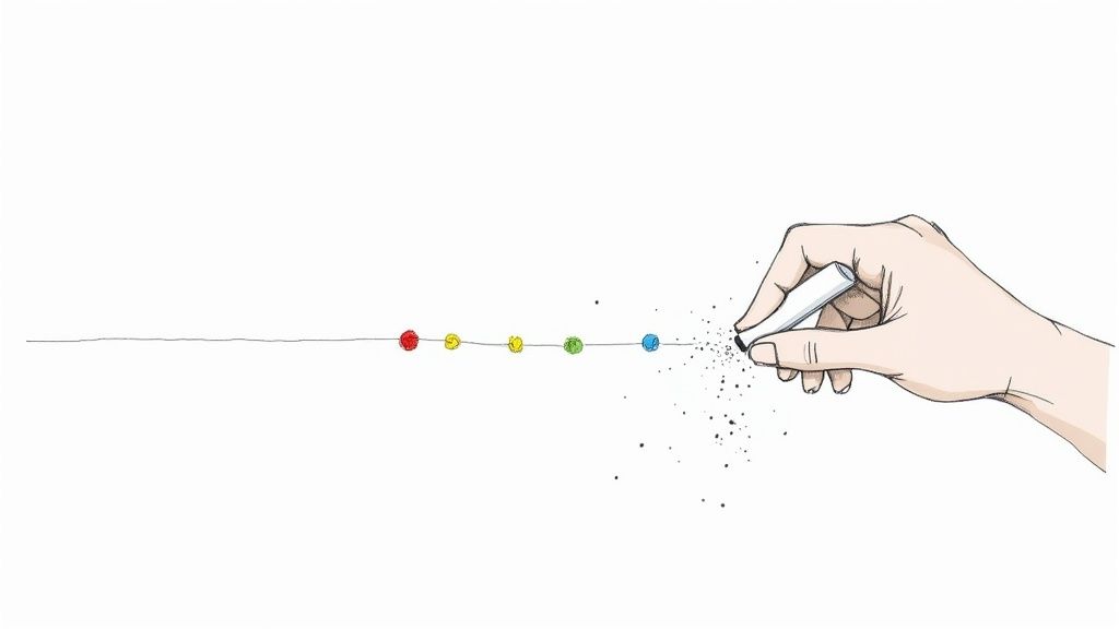
That’s the core problem: Jenkins keeps data in silos. Every build is its own little island, which makes it incredibly difficult to spot trends, understand performance issues over time, or just get a feel for the health of your entire CI/CD ecosystem at a glance. You end up digging through individual build histories, which is slow and almost never gives you the big picture.
A Grafana Jenkins dashboard completely changes that dynamic.
From Raw Data to Actionable Intelligence
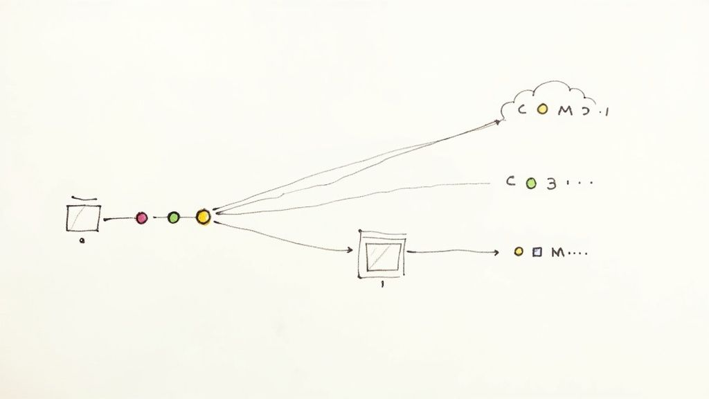
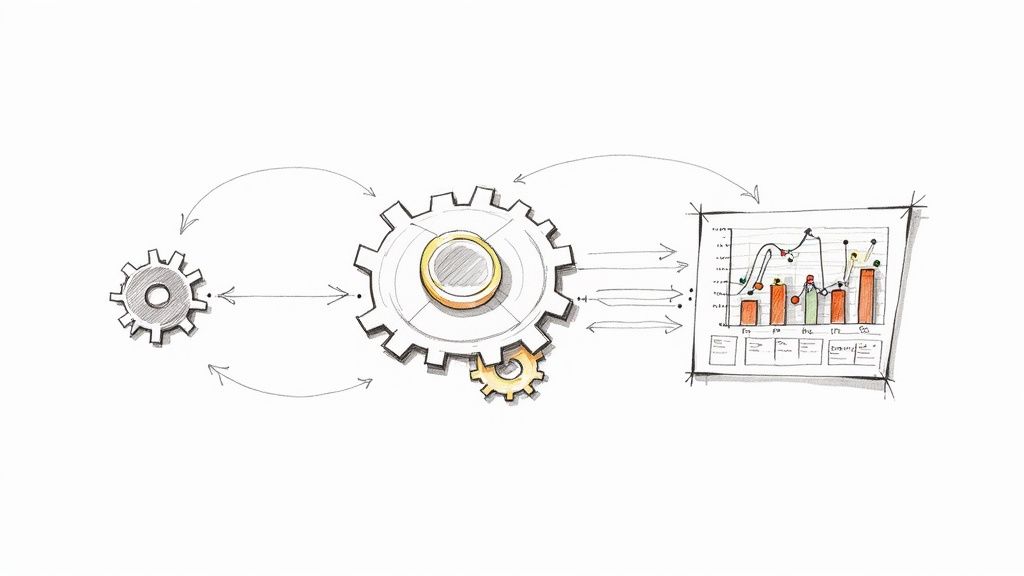
The real magic of this integration is its ability to pull together and visualize all those scattered data points. Instead of just seeing that a single build failed, you can see the rate of failures across all your projects. You can track how build durations are trending and identify which stages of your pipeline are consistently the slowest.
You go from just reacting to problems to proactively optimizing your entire workflow.
The infographic below shows this perfectly—it illustrates how the integration transforms messy Jenkins logs into valuable insights on key metrics like build failure rates and deployment frequency.
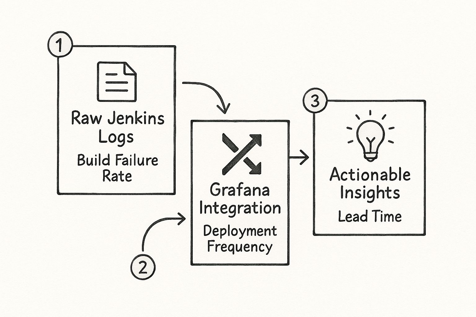
This flow really highlights the shift from isolated data points to a cohesive, intelligent view of your software delivery lifecycle.
It's no surprise that the demand for these kinds of advanced, interactive dashboards is on the rise. A recent survey of 1,255 observability practitioners found that while these practices are getting more attention from executives, cost and complexity are still major roadblocks for many teams. This is exactly why people are looking for tools that simplify their processes and deliver better results. You can check out the full findings on observability maturity in their survey.
Key Takeaway: Integrating Grafana doesn't just give you prettier charts. It fundamentally changes how you interact with your CI/CD data, turning monitoring from a tool you use after something breaks into a strategic asset that guides continuous improvement.
Jenkins Native UI vs Grafana Dashboard Comparison
To put it in perspective, let's do a quick side-by-side comparison. It really highlights the advantages of using Grafana for Jenkins monitoring over sticking with the default interface.
| Feature | Jenkins Native UI | Grafana Jenkins Dashboard |
|---|---|---|
| Data Visualization | Basic build lists and logs. No advanced charting. | Rich, customizable graphs, charts, and heatmaps. |
| Historical Analysis | Limited to individual build histories. Hard to spot trends. | Easily track metrics over time (weeks, months). |
| Data Aggregation | Data is siloed per job. No cross-project views. | Aggregate data from multiple Jenkins instances and jobs. |
| Alerting | Basic email notifications for job status. | Advanced, condition-based alerting on any metric. |
| Customization | Very limited UI customization options. | Fully customizable dashboards tailored to specific teams. |
| Data Sources | Only shows Jenkins data. | Combines Jenkins data with other sources (Prometheus, etc.). |
As you can see, while Jenkins is a powerhouse for automation, Grafana is the clear winner for observability and analysis. They really are better together.
For teams ready to make the leap, getting the foundations right is key. You can get a much deeper look by exploring our comprehensive guide on building a Jenkins dashboard. This isn't just about the technical setup; it's about shifting your team's mindset toward making data-driven decisions in your day-to-day development workflow.
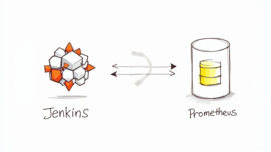
Establishing Your Monitoring Foundation with Prometheus
Before a single graph can pop up on your Grafana dashboard, you need a solid stream of data flowing from Jenkins. That's where Prometheus steps in. It's the time-series database that will collect, store, and serve up all those juicy Jenkins metrics for Grafana to visualize.
Think of it like building the plumbing before you turn on the faucet. Without this critical data pipeline, Grafana is just an empty canvas.
Our first job is to get Jenkins to expose its internal metrics in a format Prometheus can actually understand. We'll do this with the Jenkins Prometheus plugin—a simple but essential tool that creates a dedicated metrics endpoint.
Installing and Configuring the Jenkins Plugin
Getting the plugin up and running is pretty straightforward. Just head over to Manage Jenkins > Plugins and search for "Prometheus metrics" in the Available plugins tab. Once you install it, a quick restart of your Jenkins instance is all it takes to activate it.
After the restart, you'll spot a new configuration area under Manage Jenkins > System. This is where you can tweak the path for the metrics endpoint, which defaults to /prometheus. You can also lock down access by requiring authentication—something I'd strongly recommend for any production setup.
A common pitfall I’ve seen teams run into is forgetting about firewalls and network rules. Your Prometheus server needs a clear path to your Jenkins instance on the right port and path. Always double-check that this connection isn't getting blocked somewhere along the way.
With the plugin active, Jenkins is now broadcasting a ton of valuable data. The next piece of the puzzle is telling Prometheus where to listen. This means hopping into your Prometheus configuration file, usually called prometheus.yml, and adding a new scrape configuration just for your Jenkins target.
If you want to zoom out and understand the bigger picture, getting familiar with the core principles of software observability provides great context for why this data collection is so fundamental.
Setting Up the Prometheus Scrape Configuration
Inside your prometheus.yml file, you’ll need to define a new job under the scrape_configs section. This configuration tells Prometheus two key things: how often to check for new data and exactly where to find the Jenkins endpoint.
Here’s a practical example of what that snippet looks like:
scrape_configs:
- job_name: 'jenkins'
scrape_interval: 15s
metrics_path: '/prometheus'
static_configs:- targets: ['your-jenkins-server-address:8080']
Let's break down what this little block of code does:
job_name: 'jenkins': This gives the incoming data a clean label, making it easy to identify your Jenkins metrics.scrape_interval: 15s: This sets the polling frequency. Prometheus will pull data every 15 seconds.metrics_path: '/prometheus': This tells Prometheus which endpoint to hit. It absolutely must match the path you configured in the Jenkins plugin.targets: ['your-jenkins-server-address:8080']: This is the most important part. Replace the placeholder with the actual network address and port of your Jenkins server.
The image below gives you a sense of a well-structured Prometheus configuration file and where your new Jenkins job would slot in.
Once you save this configuration and restart Prometheus, it will immediately start pulling in data from Jenkins. This establishes the critical link between your CI/CD server and your monitoring backend, laying all the groundwork needed to finally bring it all together in Grafana.
Alright, you've got Jenkins pumping out metrics and Prometheus is busy collecting them. Now for the fun part: making all that data actually mean something in Grafana. This is where the raw numbers transform into a living, breathing picture of your CI/CD pipeline’s health.
The first thing we need to do is tell Grafana where to find this goldmine of information.
Hooking Up the Prometheus Data Source
You’ll need to add Prometheus as a new data source inside your Grafana instance. Don't worry, it's pretty straightforward. Just head over to the Connections > Data sources section in the Grafana UI.
From there, you'll simply plug in the network address for your Prometheus server. It's usually something like http://prometheus-server-address:9090.
Once you've entered the URL, do yourself a favor and hit the "Save & test" button. Grafana will ping Prometheus to make sure they can talk to each other. A little green checkmark is your all-clear signal, confirming the data pipeline is officially open for business.
Get an Instant Win by Importing a Dashboard
Before you start wrestling with PromQL queries and building panels from scratch, I highly recommend grabbing a pre-built community dashboard. It’s the fastest way to get immediate value.
The Grafana dashboard marketplace is packed with templates other engineers have already built and shared, giving you an incredible head start. You get instant visualizations without having to write a single line of code.
Just navigate to the Dashboards section in Grafana and click the "Import" button. You can upload a JSON file if you have one, but it's often easier to just paste in the dashboard ID from the official marketplace. A quick search for "Jenkins" will turn up some fantastic options.
Here’s a look at the marketplace, where you can find dashboards for just about anything, including Jenkins.

This repository is an absolute lifesaver. It can save you hours of setup time and give you some great ideas for your own custom dashboards down the line.
Interestingly, while lots of teams use Jenkins, not many take that extra step to integrate it with a powerful monitoring tool like Grafana. The data shows that while Jenkins dashboard technology is found on 7.1% of sites using dashboard tools, Grafana itself is only on 0.6% of them. This tells me there's a huge opportunity for teams to get a real advantage by building out a more sophisticated monitoring setup. You can even explore more technology adoption stats to see how different tools stack up.
Pro Tip: When you import a dashboard, Grafana will ask you to select your Prometheus data source. This is where you'll pick the connection we just configured. It’s the final step that links the dashboard's queries to your actual Jenkins data, making all those charts and graphs light up.
Importing a dashboard isn't just a shortcut; it's a fantastic learning opportunity. Pop open the hood on any panel and inspect the queries being used. Deconstructing how others have visualized different metrics is one of the best ways to learn PromQL in a real-world context. This reverse-engineering will prepare you to build a truly custom Grafana Jenkins dashboard that's a perfect fit for your team's unique workflow.
Building Your Own Dashboard Panels from Scratch
Importing a pre-built dashboard is a fantastic starting point, but the real magic happens when you start building your own panels. This is where you graduate from generic templates and start making Grafana answer your team's most pressing questions. Crafting panels from the ground up isn't just about getting more control; it's about deeply understanding what your metrics are trying to tell you.
While Grafana is a giant in the monitoring world, you might be surprised to find that its official dashboard gallery has only a handful of community-built options for Jenkins. Most of them are pretty niche, focusing on operational details like executor availability or JVM health. To get the kind of insights that actually matter to your business and development velocity, you have to roll up your sleeves and build them yourself.
Let's walk through creating three essential panels that will deliver immediate value to any development team.
Visualizing Build Health with a Stat Panel
The first question every team wants answered is simple: are our builds passing or failing? A Stat panel is perfect for this. It gives you a clean, color-coded, at-a-glance view of your overall build health. The goal here is to calculate a simple success rate over a recent time period.
To get this number, you'll need two separate queries to figure out the ratio of successful builds to the total number of builds.
- Count Successful Builds:
sum(rate(jenkins_builds_success_total[5m])) - Count Total Builds:
sum(rate(jenkins_builds_total[5m]))
In the panel options, you'll apply a "Reduce" transformation to perform a binary operation, dividing the result of the first query by the second. Then, set the visualization to "Stat," format the unit as "Percent (0-1.0)," and configure your color thresholds. You want green for high success rates and red for when things are going south.
This single panel instantly flags if a recent commit has destabilized your main branch.
Key Takeaway: Don't over-engineer your most critical metrics. A single, clear number showing your build success rate is often far more powerful than a complicated graph. It’s the first thing your team will check every morning.
Tracking Performance with a Build Duration Graph
Slow builds are the silent killer of team productivity. A time-series graph that tracks the average duration of a specific job is crucial for spotting performance regressions before they become a major headache. It helps you answer questions like, "Did that new test suite just slow down our entire pipeline?"
For this, the Time series visualization is your best friend.
Here’s the PromQL query you'll need to get started:
jenkins_builds_duration_milliseconds_summary_sum{job="your-job-name"} / jenkins_builds_duration_milliseconds_summary_count{job="your-job-name"}
Just remember to swap out "your-job-name" with the actual name of the Jenkins job you want to watch. This query calculates the average build duration by dividing the total time spent in builds by the total number of builds. If you see this graph trending upwards, it's a clear signal for your team to start investigating.
Monitoring Load with an Executor Usage Gauge
Finally, you need to keep an eye on your Jenkins cluster's capacity. Are your build agents getting swamped? A Gauge panel is the perfect way to show the current utilization of your Jenkins executors in real time.
This visualization helps you make smarter decisions about when to scale your infrastructure. You'll need two queries:
- Query for Busy Executors:
jenkins_executor_count_value{type="busy"} - Query for Total Executors:
jenkins_executor_count_value{type="total"}
Use a transformation to combine these, calculating the percentage of busy executors against the total available. By setting color thresholds—maybe yellow at 70% and red at 90%—you'll get an immediate visual alert when your cluster is nearing its limit. A truly great continuous integration dashboard gives you visibility into both the software pipeline and the hardware it depends on.
Advanced Dashboard Techniques and Troubleshooting
A static dashboard has its place, but an interactive one is a genuine powerhouse for your team. To really level up your Grafana Jenkins dashboard, you need to move beyond fixed views and start embracing dynamic elements that let your team actually explore the data. We're talking about adding variables, setting up smart alerts, and, of course, knowing how to fix things when they inevitably go sideways.
The ultimate goal here is to build a single dashboard that adapts to what you need to see. Instead of cloning dashboards for every single project—which gets messy fast—you can build one comprehensive view with filters. Trust me, this approach not only saves a ton of time but also makes your whole monitoring setup cleaner and much easier to maintain down the road.
Making Your Dashboard Interactive with Variables
One of the quickest wins for making your dashboard more useful is adding variables. Think of them as dynamic filters that empower anyone on your team to drill down into specific data points without ever needing to write a single line of PromQL. It’s a game-changer.
A classic, highly effective example is creating a variable that lists all of your Jenkins job names. This lets a user pick a specific job from a simple dropdown menu, and poof—all the panels on the dashboard instantly update to show metrics for just that job.
Here’s how to get that set up:
- Head over to your dashboard’s settings and click on Variables.
- Add a new variable and set its type to Query.
- In the query field, use
label_values(jenkins_builds_total, job). This tells Grafana to grab a list of all uniquejoblabels from that metric in Prometheus.
With that one small change, you’ve just transformed your dashboard from a static report into a truly interactive analysis tool.
Proactive Monitoring with Grafana Alerts
Visualizing data is fantastic for spotting trends, but let's be realistic—no one can stare at a dashboard all day. This is where Grafana Alerts come into play. You can configure rules to proactively ping your team about critical events, like a sudden spike in build failures or a job that’s taking way longer than usual to complete.
For instance, you could set an alert on your "Build Health" panel. A good rule of thumb is to have it trigger if the success rate dips below 90% for more than 15 minutes. Grafana can then fire off a notification directly to a team's Slack channel or even create a PagerDuty incident. This makes sure the right people know there's a problem, right when it happens.
Setting up alerts is what closes the loop on your monitoring strategy. It shifts your team from a reactive "let's go check the dashboard" mindset to a proactive one where important issues are pushed directly to you.
Common Troubleshooting Scenarios
Even with the most careful setup, you're bound to run into a snag or two. Knowing where to look first is the key to a quick fix. When things go wrong, it's usually one of a few common culprits.
Here’s a quick reference table to help you diagnose and solve some of the most frequent issues you might face when getting your Grafana Jenkins dashboard up and running.
| Symptom | Likely Cause | Solution Steps |
|---|---|---|
| "No data points" error | Prometheus can't scrape the Jenkins endpoint. | Check that the targets address in your prometheus.yml is correct. Also, make sure no firewall rules are getting in the way and blocking the connection. |
| Metrics are missing | The Jenkins Prometheus plugin is misconfigured, or a specific job isn't exposing its data. | Dive into the Jenkins system configuration to ensure the plugin is enabled globally. Then, double-check the configuration for the individual job in question. |
| Incorrect data in panels | The PromQL query is flawed or targeting the wrong metric labels. | Your best friend here is the Grafana "Explore" feature. Use it to test and refine your queries against the raw data from Prometheus until you get exactly what you need. |
Most of the time, the problem is a simple typo in a configuration file or a misunderstanding of a PromQL query. Working through these common scenarios will help you build the intuition to debug almost any issue that comes your way.
Got Questions About Grafana Jenkins Dashboards?
Even with the best guide in hand, you’re bound to hit a few practical questions when setting up your first real monitoring dashboard. I get it. To help you out, I’ve put together answers to some of the most common questions we see from teams diving into this for the first time.
We'll cover which metrics to actually focus on, what to do if Prometheus isn't your jam, and how to keep your new setup secure.
What Metrics Should I Actually Monitor?
When you first connect everything, the sheer number of available metrics can be completely overwhelming. My advice? Don't try to boil the ocean. Start with the numbers that give you a direct signal on your team's delivery performance and the overall health of your CI/CD setup.
Here’s a solid starting point that I recommend to most teams:
- DORA Metrics: These are the big four for a reason. Deployment Frequency, Lead Time for Changes, Change Failure Rate, and Time to Restore Service give you a fantastic high-level pulse on your entire DevOps process.
- Build Duration Trends: Keep a close eye on the average time your key builds are taking. This is often the first place you'll spot a performance regression creeping in. A slow pipeline is a huge drag on developer productivity.
- Executor Utilization: Are you constantly hitting a wall with your builds? Monitoring your busy versus available Jenkins executors will tell you if you're maxing out your resources or if you have a bottleneck.
- Build Health: Sometimes, the simplest metrics are the most powerful. A straightforward success-versus-failure rate for your most critical jobs is an indispensable, at-a-glance health check.
Can I Use Something Other Than Prometheus?
Absolutely. While Prometheus is definitely the most common dance partner for a Grafana Jenkins dashboard—mostly because the integration is so smooth—it's far from the only game in town. Other time-series databases can work just as well, and your choice often comes down to what your team is already using.
For example, InfluxDB is a popular alternative and has its own dedicated Jenkins plugin that makes setup a breeze. Or, if your organization centralizes all its logs in Elasticsearch, you can just as easily configure Jenkins to ship its build logs there and use that as your Grafana data source.
The best tool is almost always the one your team is already comfortable with. Stick with what fits into your existing workflow and is easiest for everyone to maintain.
How Do I Make Sure My Jenkins Metrics Endpoint Is Secure?
This is a big one. Exposing your Jenkins metrics is incredibly useful, but it also opens up a new endpoint that you absolutely have to secure. Leaving it wide open can leak sensitive info about your build infrastructure and even project names.
Thankfully, the Jenkins Prometheus plugin has built-in security options to handle this. You should always configure it to require authentication. This is non-negotiable. It ensures that only authorized clients, like your Prometheus server, can actually pull data from the /prometheus endpoint.
For an extra layer of defense in a production environment—and I highly recommend this—use network security rules or firewall configurations to restrict access to the specific IP address of your Prometheus instance. Combining application-level and network-level security like this is a solid best practice for any serious setup.
A great dashboard gives you visibility, but true CI/CD efficiency is born from a smarter merge process. Mergify gives your team the power to automate pull request workflows, prioritize the most critical changes, and slash your CI costs. See how our Merge Queue can bring much-needed stability and speed to your development lifecycle at https://mergify.com.